%config InlineBackend.figure_format = 'retina'
Plotting with matplotlib#
Why use matplotlib?#
While seaborn is a versatile tool to accomplish most plotting tasks, you may find there are situations in which you need a greater degree of customization. This additional flexibility can be accomplished with the most common Python plotting tool, matplotlib, although the more advanced applications do have a steeper learning curve. You can construct nearly any static plot you can imagine using matplotlib given sufficient patience to do so.
Before we dive into how to use this tool, take a look at this gallery of examples of matplotlib in action. There is no shortage of possibilities of plots including: line plots, scatter plots, bar plots, contour plots, heatmaps, image plots, quiver plots, box plots, errorbar plots, pie plots, polar plots, 3 dimensional plots, and many more. Enhancing these many types of plots is the ability to annotate plots with shapes and text, adjust colors and styles to your delight, customize legends, adjust axes, create subplots, and combine plot types to create the plot you’ve always been dreaming of.
The basic plotting features of matplotlib can be learned quickly; however, advanced plotting and customization requires a deeper knowledge of this plotting tool. Becoming proficient with using matplotlib is well-worth it, since many Python data science tools and APIs use matplotlib as a native plotting tool, including pandas and xarray.
Basic Plotting#
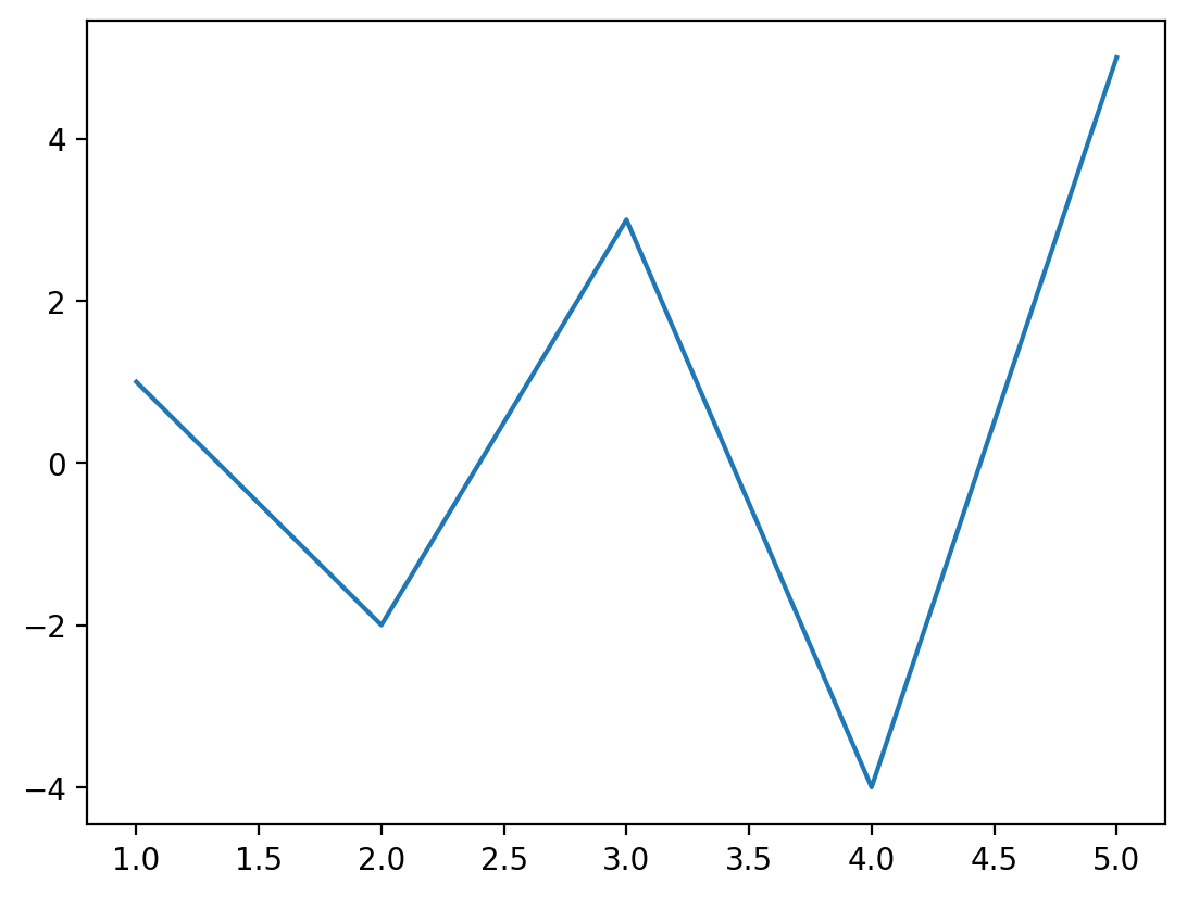
Getting started with plotting using matplotlib is relatively simple for the most basic plots such as line plots, bar plots, and scatter plots. Let’s create a quick plot of each of these. First, let’s create some data to plot:
# Create some data to plot
x = [1, 2, 3, 4, 5]
y = [1, -2, 3, -4, 5]
Creating the plot is simple: after we’ve imported the pyplot module from the matplotlib package, we can use it to create a figure that contains a set of axes on which to place the plot, fig, ax = plt.subplots(), then we plot the data on the specified axes, ax.plot(x,y), and finally we specify that the plot be rendered on the screen using plt.show(). This last item is not always required in an interactive terminal or in Jupyter notebooks, but is generally required to guarantee the plot is displayed.
That’s it! Your first plot is complete.
import matplotlib.pyplot as plt

fig, ax = plt.subplots()
ax.plot(x, y)
plt.show()
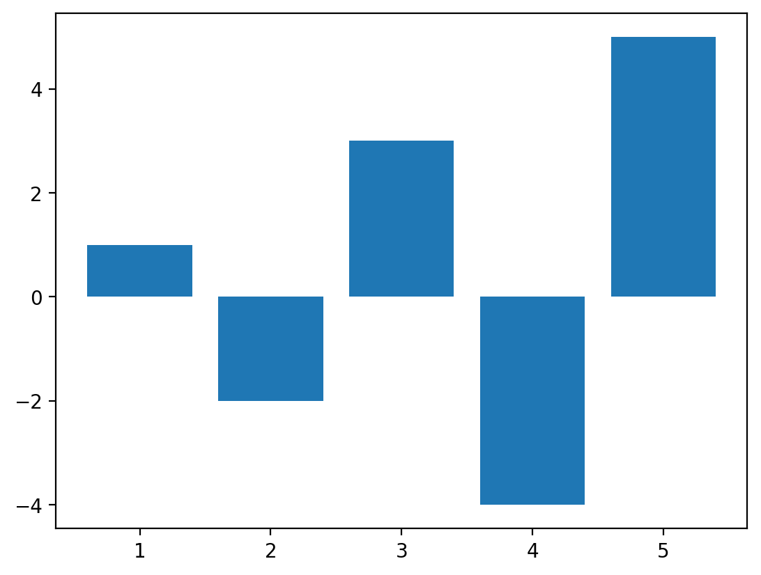
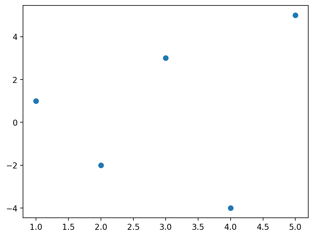
Following the same approach, we can create a simple bar plot and a scatter plot of the same data.
fig, ax = plt.subplots()
ax.bar(x, y)
plt.show()
fig, ax = plt.subplots()
ax.scatter(x, y)
plt.show()
At it’s most basic, that’s all you need for plotting. Of course, these plots are missing many important things that you may want to include: axis labels, legends, grid lines, title, and more. We can customize each of these. Before we dive in to each of those, let’s discuss the different components of a plot that you may want to customize and common adjustments and uses of each. The plot below (adapted from the matplotlib documentation) was created entirely using matplotlib and demonstrates the incredible customization capabilities of this tool. We’ll discuss each of the items on this figure and how to customize them.
NOTE: Don’t worry if much of the plotting code below is unfamiliar - many of the tweaks that are shown here are not commonly used and all are explained in detail in the matplotlib documentation. We’ll talk about the most important pieces to know to be able accomplish most common plotting tasks.
# ```{code-cell}
# :tags: ["hide-input"]
# ```

"""
This code was adapted from `matplotlib`'s documentation, and the original can
be found at: https://matplotlib.org/stable/gallery/showcase/anatomy.html
"""

import matplotlib.pyplot as plt
import numpy as np

from matplotlib.patches import Circle
from matplotlib.patheffects import withStroke

royal_blue = [0, 20 / 256, 82 / 256]

np.random.seed(19680801)

# Create the data
X = np.linspace(0.5, 3.5, 100)
Y1 = 3 + np.cos(X)
Y2 = 1 + np.cos(1 + X / 0.75) / 2
Y3 = np.random.uniform(Y1, Y2, len(X))

# Make the plot
fig, ax = plt.subplots(figsize=(9, 9))

ax.set_xlim(0, 4)
ax.set_ylim(0, 4)

ax.tick_params(which="major", width=1.0, length=10, labelsize=14)
ax.tick_params(which="minor", width=1.0, length=5, labelsize=10, labelcolor="0.25")

ax.grid(True, linestyle="--", linewidth=0.5, color=".25", zorder=-10, which="both")

ax.plot(X, Y1, c="C0", lw=2.5, label="Blue signal", zorder=10)
ax.plot(X, Y2, c="C1", lw=2.5, label="Orange signal")
ax.plot(
    X[::3],
    Y3[::3],
    linewidth=0,
    markersize=9,
    marker="s",
    markerfacecolor="none",
    markeredgecolor="C4",
    markeredgewidth=2.5,
)

ax.set_title("Anatomy of a figure", fontsize=20, verticalalignment="bottom")
ax.set_xlabel("x Axis label", fontsize=14)
ax.set_ylabel("y Axis label", fontsize=14)
ax.legend(loc="upper right", fontsize=14)


# Annotate the figure


def annotate(x, y, text, code):
    # Circle marker
    c = Circle(
        (x, y),
        radius=0.15,
        clip_on=False,
        zorder=10,
        linewidth=2.5,
        edgecolor=royal_blue + [0.6],
        facecolor="none",
        path_effects=[withStroke(linewidth=7, foreground="white")],
    )
    ax.add_artist(c)

    # use path_effects as a background for the texts
    # draw the path_effects and the colored text separately so that the
    # path_effects cannot clip other texts
    for path_effects in [[withStroke(linewidth=7, foreground="white")], []]:
        color = "white" if path_effects else royal_blue
        ax.text(
            x,
            y - 0.2,
            text,
            zorder=100,
            ha="center",
            va="top",
            weight="bold",
            color=color,
            style="italic",
            fontfamily="monospace",
            path_effects=path_effects,
        )


annotate(1.68, -0.39, "xlabel", "ax.set_xlabel")
annotate(-0.38, 1.67, "ylabel", "ax.set_ylabel")
annotate(1.52, 4.15, "Title", "ax.set_title")
annotate(1.75, 2.80, "Line", "ax.plot")
annotate(2.25, 1.54, "Markers", "ax.scatter")
annotate(3.00, 3.00, "Grid", "ax.grid")
annotate(3.60, 3.58, "Legend", "ax.legend")
annotate(2.5, 0.55, "Axes", "fig.subplots")
annotate(4, 4.5, "Figure", "plt.figure")
annotate(0.65, 0.01, "x Axis", "ax.xaxis")
annotate(0, 0.36, "y Axis", "ax.yaxis")
annotate(4.0, 0.7, "Spine", "ax.spines")

# frame around figure
fig.patch.set(linewidth=4, edgecolor="0.5")
plt.show()
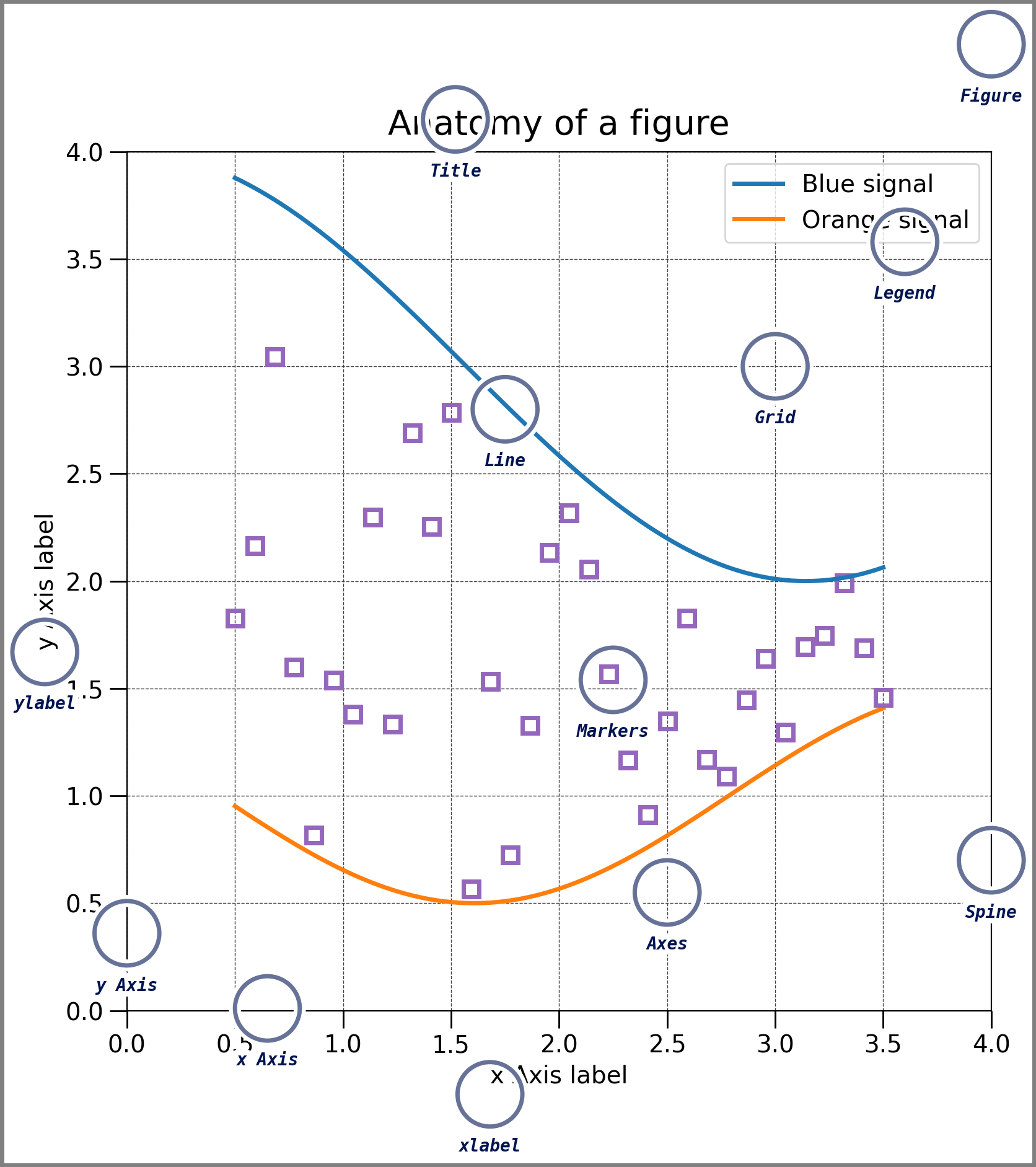
Plot component |
Purpose |
Example of code to add or create the component |
|---|---|---|
Figure |
The container for one or more sets of axes on which plots are built |
|
Axes |
A canvas on which plotting happens |
|
x-axis label |
Label for the x axis |
|
y-axis label |
Label for the y axis |
|
Grid |
Grid line to appear behind the plot |
|
Title |
Title of the figure |
|
Legend |
Figure legend containing lines, markers, or other symbology |
|
Line |
Plot representing a series of connected points |
|
Markers |
Plot representing a point in a dataset |
|
Spines |
The lines that make up the outer edge of the axes |
|
Figures and axes#
Every plot is composed of a few key pieces: the figure, which contains one or more axes, and the axes themselves, onto which you can add plots that share the same axes. This is created for you with the fig, ax = plt.subplots() command, where fig is your figure object and ax is your axes object. But what is a figure and what are axes and how are they different? You can think about a figure as a page in a scrap book - it’s a place to hold all the interesting things you’re about to add to it. You are mainly going to care about how big it is so you can determine whether it will fit the items you want to add to the page. Axes are like the photos you may add to the pages of a scrap book. Axes are the photographs that you add to the scrap book. You might have one big photo that will take up the whole page, or a number of smaller photos that you want to display together. These are your axes. We perform all of our plotting on the axes, NOT on the figure. We can plot multiple things on an axes (lines and points, etc.), but they collectively form one axes .
We can create multiple axes on the same figure by specifying how many subplots we’d like in the subplots method:
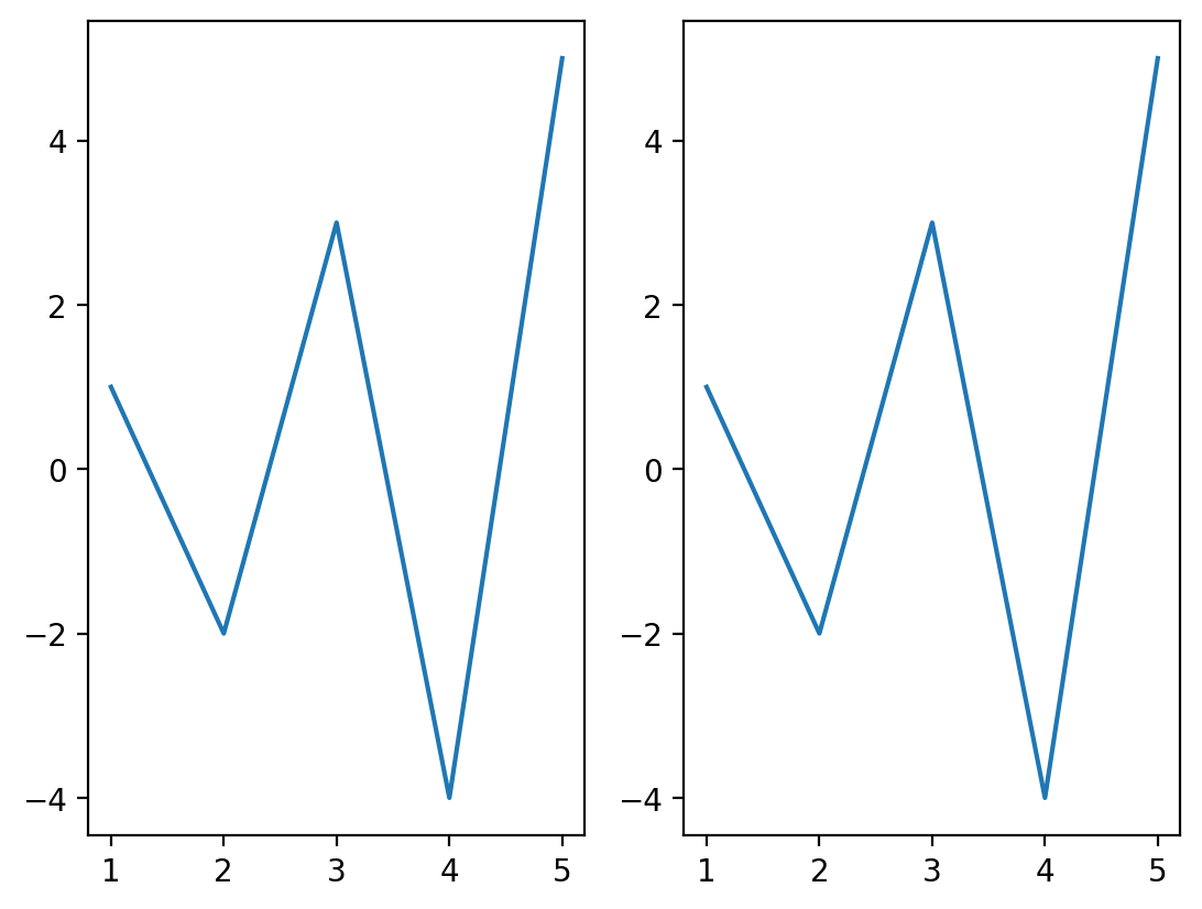
fig, (ax1, ax2) = plt.subplots(1, 2)  # nrows, ncols of axes
ax1.plot(x, y)
ax2.plot(x, y)
plt.show()
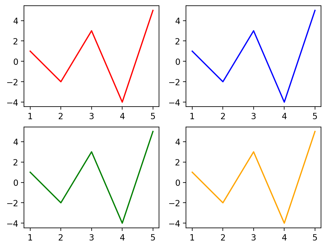
We can even have multiple rows and multiple columns of subplots. In this case, the ax object is a list of lists, since there will be one list for each row of axes. Here we adjust the color of the line in each plot by setting the color keyword to demonstrate that these are four unique plots across the four axes.
fig, ax = plt.subplots(2,2) # nrows, ncols of axes
ax[0][0].plot(x,y,color='red')
ax[0][1].plot(x,y,color='blue')
ax[1][0].plot(x,y,color='green')
ax[1][1].plot(x,y,color='orange')
plt.show()
Note
it’s important to note the difference between axes and the x and y axis. A set of axes is the area of a figure upon which plots are built, while an axis (typically x or y) are the pieces that get ticks and labels (if you choose to include them).
Explicit vs implicit syntax#
A common source of confusion is the difference between explicit and implicit plotting syntax in matplotlib. This is the difference between using ax.plot() notation (explicit syntax) versus using plt.plot() (implicit syntax). The explicit syntax tells matplotlib exactly which set of axes you’d like to place the plot (in this case ax). Implicit syntax assumes which axes you want to add the plot to, and in this case, it would be the last axes that you created or used. You’ll often see the implicit syntax in tutorials and Stack Overflow discussions, however, I strongly encourage you to use the explicit syntax to avoid confusion, especially in cases when you’re creating subplots.
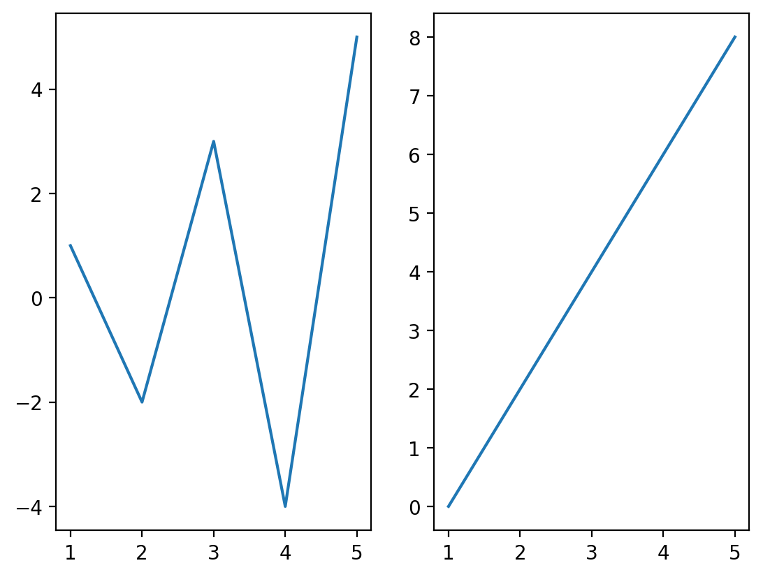
Let’s take a quick look at an example of what happens when you try to use implicit and explicit syntax in a situation with subplots using the data below. Let’s say we want to plot y1 on a plot on the left and y2 on a plot on the right
# Create some data to plot
x = [1,2,3,4,5]
y1 = [1,-2,3,-4,5]
y2 = [0, 2, 4, 6, 8]
Let’s start with the explicit syntax - we create a plot with two subplots and plot each on the corresponding axes:
fig, (ax1,ax2) = plt.subplots(1,2) # nrows, ncols of axes
ax1.plot(x,y1)
ax2.plot(x,y2)
plt.show()
Now, let’s repeat this using implicit syntax following the same formula:
fig, (ax1,ax2) = plt.subplots(1,2) # nrows, ncols of axes
plt.plot(x,y1)
plt.plot(x,y2)
plt.show()
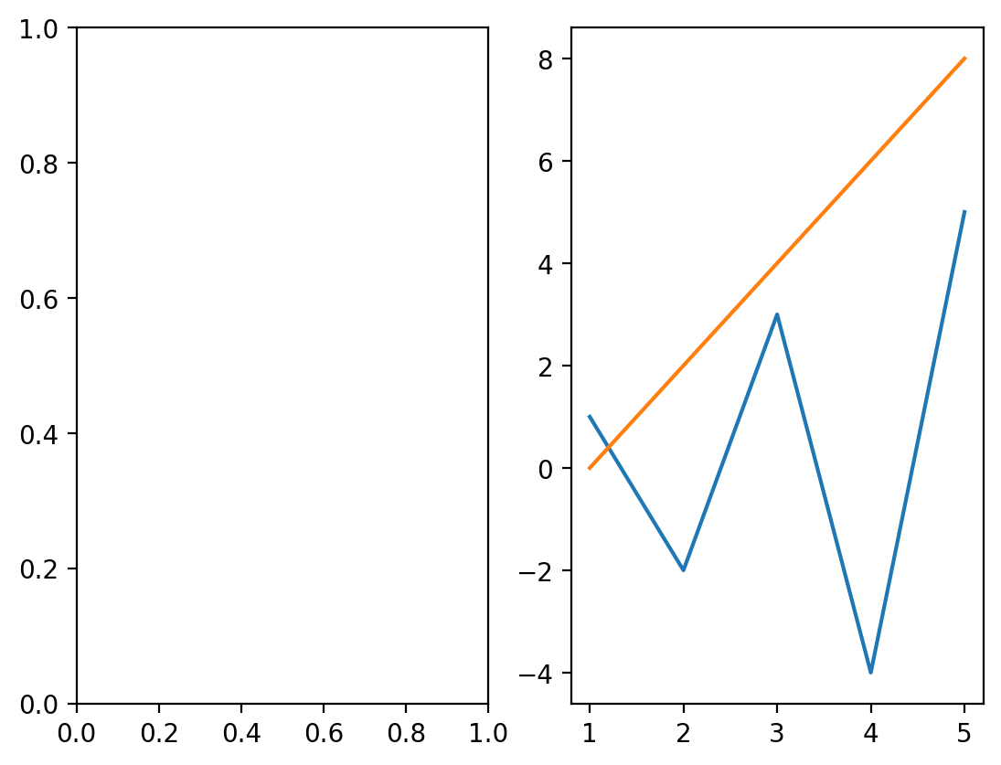
What happened here? In this case, matplotlib created the left axes first, then the right axes, so the last axes that was created was the one on the right. Therefore, the implicit syntax (plt.plot()) assumes you want to plot things on the last plot used, hence you get the two plots of y1 and y2 on the same set of axes. To correct this, you have to make the axes you want to plot on become “active”, which can be done using plt.sca(). However, this is cumbersome, as shown below. Using the axes-centered explicit syntax removes any potential ambiguity from your code which becomes even more challenging when you begin customizing plots.
fig, (ax1,ax2) = plt.subplots(1,2) # nrows, ncols of axes
plt.sca(ax1)
plt.plot(x,y1)
plt.sca(ax2)
plt.plot(x,y2)
plt.show()
Basics of axis labels, grid lines, titles, and legends#
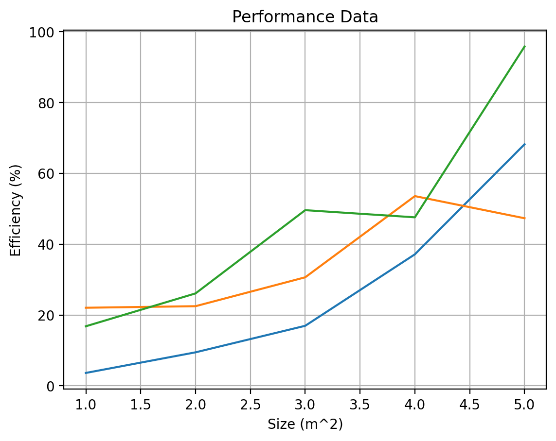
With those basics out of the way, let’s create a proper figure with axis labels and all. Let’s add one more set of data to make it a bit more interesting as well. Let’s assume we’re comparing the performance of three different models: A, B, and C that are estimating the efficiency of an estimation tool over different size areas of increasing size.
# Create some data to plot
x = [1, 2, 3, 4, 5]
y1 = [3.64, 9.46, 16.95, 37.14, 68.22]
y2 = [22.05, 22.49, 30.65, 53.58, 47.33]
y3 = [16.82, 26.10, 49.61, 47.59, 95.82]
fig, ax = plt.subplots()
ax.plot(x, y1)
ax.plot(x, y2)
ax.plot(x, y3)
ax.set_title("Performance Data")
ax.set_xlabel("Size (m^2)")
ax.set_ylabel("Efficiency (%)")
ax.grid(True)
plt.show()
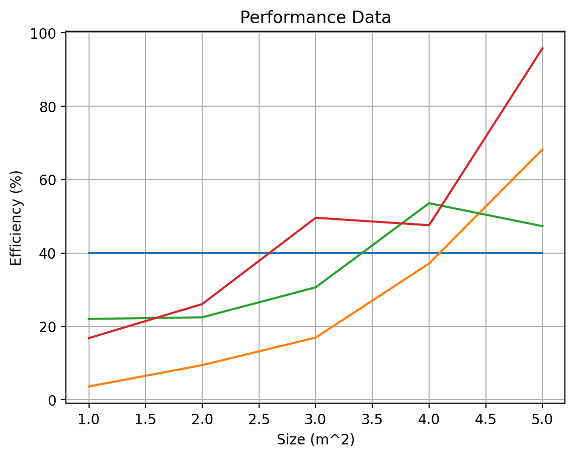
Now, let’s say we want to add a baseline model for comparison - one that is constant for all x values. We can do this by creating a pair of points that correspond to the baseline value; let’s say the baseline value is 40. Then we want to draw a line from (1,40) to (5,40). We can do that as follows:
baseline = 40

fig, ax = plt.subplots()

ax.plot([x[0], x[-1]], [baseline, baseline])  # Plot the baseline
ax.plot(x, y1)
ax.plot(x, y2)
ax.plot(x, y3)

ax.set_title("Performance Data")
ax.set_xlabel("Size (m^2)")
ax.set_ylabel("Efficiency (%)")
ax.grid(True)
plt.show()
We can add a legend by incorporating additional keyword parameter of “label” for each of the plots, to designate what these lines should each be called, then calling the legend method to add it to the selected axes.
fig, ax = plt.subplots()

ax.plot([x[0], x[-1]], [baseline, baseline], label="Baseline")  # Plot the baseline
ax.plot(x, y1, label="Model A")
ax.plot(x, y2, label="Model B")
ax.plot(x, y3, label="Model C")

ax.set_title("Performance Data")
ax.set_xlabel("Size (m^2)")
ax.set_ylabel("Efficiency (%)")
ax.grid(True)
ax.legend()
plt.show()
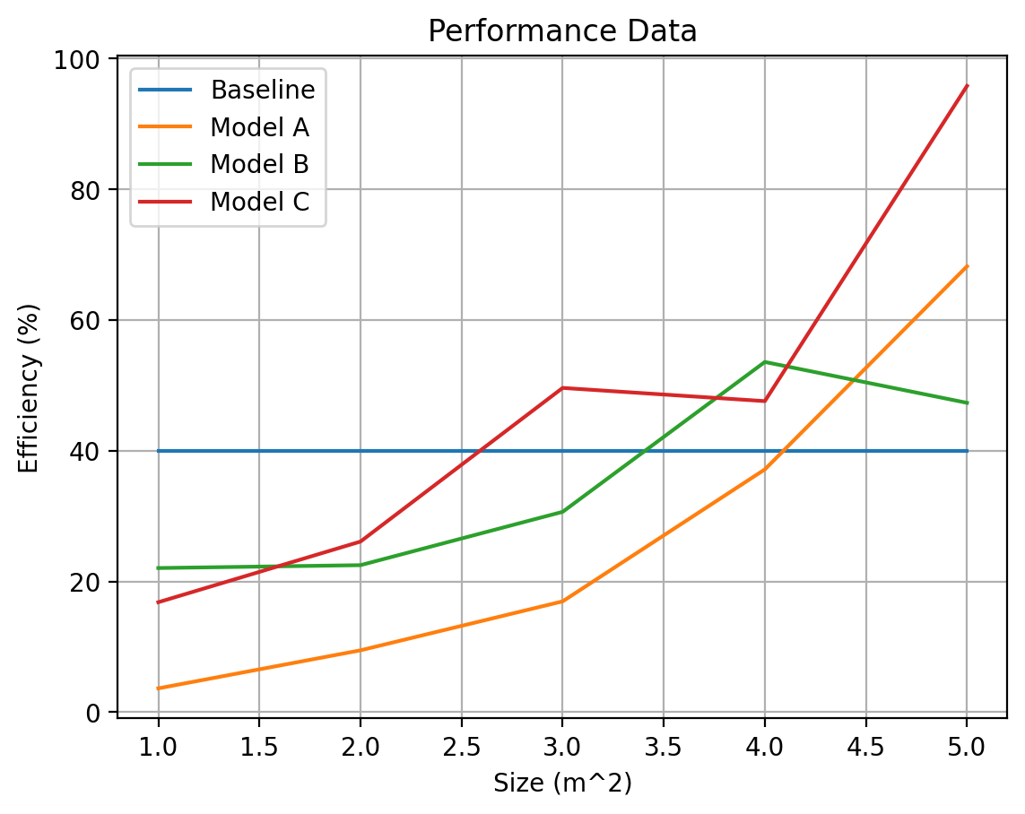
Remember one of our key software engineering insights: never repeat yourself. Here, we repeat ourselves a bit when we have three plotting lines, one for each model, A, B, C. We can add one final refinement but performing this inside a loop:
baseline = 40
labels = ["Model A", "Model B", "Model C"]  # Capture the labels in a list
y = [y1, y2, y3]  # Store each series of the data in one list

fig, ax = plt.subplots()

ax.plot([x[0], x[-1]], [baseline, baseline], label="Baseline")  # Plot the baseline
# Plot the three model lines
for i, label in enumerate(labels):
    plt.plot(x, y[i], label=label)

ax.set_title("Performance Data")
ax.set_xlabel("Size (m^2)")
ax.set_ylabel("Efficiency (%)")
ax.grid(True)
ax.legend()
plt.show()
Now that we’ve explored the basics, let’s discuss some common customizations we may be interested in applying including customizing colors, linewidths, fonts, and more.